JUX K2 Mega Menu, Hikashop Mega Menu, VirtueMart Mega Menu, Redshop Mega Menu, Joomshopping Mega Menu
- Created: 11/13/2013
- Latest update: 13/03/2020
- By: Joomseller
- www.joomseller.com/
- Email: contact@joomseller.com
INTRODUCTION
JUX K2 Mega Menu is a powerful & responsive Joomla menu module which helps you to flexibly & easily bring K2 categories & subcategories to display in menu.
With JUX K2 Mega Menu, you can make K2 categories and subcategories display as menu items. The load of menu is fast, and you can arrange all items without any difficulty. You can also bring images, videos or modules to menu and JUX Mega Menu will load it flawlessly. Plus, JUX K2 Mega Menu is totally responsive. Be it a PC or mobile's screen, menu always loads and looks nicely on your site.
For admin, the useful toolbox makes it way easier for you to configure menu – your task can be done faster and easier with supported & direct visual demo right below each backend's configuration. So, you can set up menu in backend and directly view how it will display in frontend at the same time & on the same page.
Features
- Easy to change orientation for menu
- Easily customize effect & time for submenu to display
-
Customize to every detail of Top Menu, submenu & menu items at ease, such as:
- Show/hide items, submenu of items
- Add/remove column in submenu
- Select module for added column
- Hover background color
- Border, padding, Margin
- Text & hover text color
- Totally responsive: displays on any devices
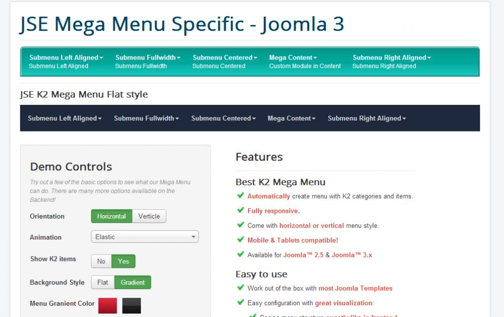
SCREENSHOT
K2 Mega menu


REQUIRE
Server Requirements
Our extension has several system requirements as follow:
- Apache 2.0 or above - http://www.apache.org recommended: Apache 2.0 or above.
- PHP 5.2.4 or above - http://www.php.net recommended: PHP 5.3 or above.
- MySQL 5.0.4 or above - http://www.mysql.com recommended: MySQL 5.0.4 or above.
- Joomla! 2.5 or above - http://www.joomla.org recommended: Joomla! 3.
You have to ensure that your system has already installed, XML and Zlib-Support built into your PHP.
PHP should be compiled with support for https (openSSL) and cURL.
PHP Safe Mode should be turned off.
Client Requirements
This module can run well on major browsers such as: Internet Explorer (version 10+), Firefox, Chrome, Opera, and Safari.
The client/browser needs to be capable of accepting Cookies and Cookies must be enabled.
INSTALLATION
After purchased our product, you’ll see the download link at JUX Mega Menu product page: http://#######.html
Please download the product package:
- pkg_jux_megamenu x.x.x.zip
Note: If there is any problem, please contact us via E-mail: contact@joomseller.com.
Package Preparation
Unpack JUX Mega Menu installation package that you downloaded to your computer. There package in JUX Mega Menu
JUX Mega Menu component Installation
Go to Administrator site => “Extension” => “Extension Manager” in the Top Menu.
In “Upload Package File” block, please Upload & Install our extensions:
Browse the JUX Mega Menu installation folder, select pkg_jux_megamenu x.x.x.zip, then choose Upload and Install
CONFIGURATION
- The Module configuration is used for general option of Mega Menu, such as: select Position, select Menu…
- The Menu Item configuration is used for setting for particular item in your Mega Menu, such as: description, number of column, width…
Module Options
- Select a Position and Publish Mega Menu module.
- Assign the menu that Mega Menu’ll display.

After that, you can set our module as you want with the detailed explanation below
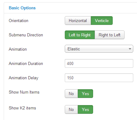
Basic Options

|
Orientation |
Choose Horizontal or Vertical menu. |
|
Submenu Direction |
Orientation chosen is Horizontal: default is Down. If you use the megamenu at page’s bottom, you need to choose direction as Up Orientation chosen is Verticle: default is Left to Right. If you use the megamenu on the right of your page, you need to choose direction as Right to Left |
|
Animation |
Animation effect for the submenu. If the Menu is Horizontal dropdown, you can use choose between: Fading, Slide, Zoom, Elastic or None effect. Other menu only has Fading or None effect. |
|
Animation Duration |
The duration time for above animation effect (in miliseconds). |
|
Animation Delay |
The delay time before the animation effect start (in miliseconds). |
|
Show Num Items |
Set show or hide number of items in category. Except for the Top menu – it always hides the number of items. |
|
Show K2 Items |
Set show or hide K2 items in menu. If you choose Hide, the Menu only show the K2’s categories. |
Advanced Options

|
Custom Css |
You can input your customized css here. It’ll affect the Menu. |
|
Module Class Suffix |
A suffix to be applied to the css class of the module. This allows individual module styling |
Menu Item Configuration
|
Add row |
Add a new row to selected submenu |
|
Hide when collapse |
Hide this column when the menu is collapsed on small screen like on mobile or tablet. |
|
Submenu Width (px) |
If Justify option in Alignment is not chosen, you can freely enter width’s value for column. If you don’t enter value in this case, default value will be 200px. |
|
Alignment |
Alignment for sub-menu. You can choose Align left, right, center or justify (full-width). |
|
Extra Class |
An extra class to be applied to the css class of this submenu. This allows individual module styling. |

Column setting
|
Add/remove column |
Add a new row to selected submenu |
|
Hide when collapse |
Hide this column when the menu is collapsed on small screen like on mobile or tablet. |
|
Width (1-2) |
Column’s width in submenu. Unit: span (maximum = 12 span, equivalent with full width of sub-menu) |
|
Module |
This dropdown button will be available when there’s newly added column. You can select a module on your site to display here. |
|
Extra Class |
An extra class to be applied to the css class of this column. This allows individual module styling. |

Menu Item Setting
|
Display |
Show or Hide this menu Item on frontEnd |
|
Submenu |
Show or Hide Sub-menu of items |
|
Group |
If YES, the menu item and its sub-items will be grouped and displayed as a column. More Detail |
|
Position |
Move menu items between columns. More Detail |
|
Extra Class |
An extra class to be applied to the css class of this menu item. This allows individual module styling. |
|
Item Caption |
Item’s Caption. The caption will be displayed as small lines of text below the Menu item title. |

Top Menu Style
|
Background Style |
Choose a Background Style. We have Flat style and Gradient style. |
|
Menu Gradient Color |
Gradient Color is the new CSS3 color effect for menu. There’re preset gradient colors. Please choose the color that best matches your style, then you can customize it. |
|
Gradient Type |
Set gradient type. With Linear you’ll have a simple gradient effect, with Glass you’ll have two gradient colors combined to make a beautiful glass effect. |
|
Gradient Start Color 1 |
Start color of Gradient 1. |
|
Gradient Start Color 2 |
Start color of Gradient 2. |
|
Gradient End Color 1 |
End color of Gradient 1. |
|
Gradient End Color 2 |
End color of Gradient 2. |
|
Border |
Set value for top menu’s border. More Detail |
|
Padding |
The CSS padding properties define the space between the element border and the element content. |
|
Margin |
The CSS margin properties define the space around elements. |
|
Border Radius |
Set border radius for each angle of Top menu. Note: for it to display nicely, you should choose 4 same values. |

Dropdown Menu Style
|
Background Color |
Choose a background color for the dropdown submenu. |
|
Border |
Set border value for the dropdown submenu. More Detail |
|
Padding |
Set the padding value. The CSS padding properties define the space between the element border and the element content. |
|
Margin |
Set the margin value. The CSS margin properties define the space around elements. |
|
Border Radius |
Set border’s radius for each angle of the dropdown submenu. Note: for it to display nicely, you should choose 4 same values. |
|
Box Shadow |
Set value for shadow. Please refer to this link for more information: |

Menu Items Style
This section includes the same configurations for Items & Dropdown items.
|
Hover Background Color |
Set background color when mouse hovering over. |
|
Border |
Set border value for the dropdown submenu. More Detail |
|
Padding |
Set the padding value. The CSS padding properties define the space between the element border and the element content. |
|
Margin |
Set the margin value. The CSS margin properties define the space around elements. |
|
Text Color |
Set text color. |
|
Hover Text Color |
Set text color when mouse hovering over. |

TIPS
When orders in K2 Mega Menu change
K2 Mega Menu module automatically fetchs information from K2 categories and K2 items; also automatically resets order & column to fit the new changes when K2 categories or K2 items have new change
Border
-
Border width: enter value in one of the below formats (note that there’s a space between values):
- [vertical border] [horizontal border]: 1px 2px
- [top border] [left border] [bottom border] [right border]: 1px 2px 3px 4px
- Border Style

- Border Color

Position
Note:
-
When you move item’s position, depend on the direction (right or left) there’ll be two cases:
- If the item we are moving is on top or bottom, only this item will be moved to another position.

→


→

-
- If we move item which is not on top or bottom (in the middle, for example), when moving this item, not only this item will change position but also other items.

→


→

- If you’re moving item but there is no column yet, a new column will be automatically created.
Group
Item with group

Item without group
