FORLIO
DOCUMENTATION
From
JOOMLAUX
TEMPLATE INSTRUCTION
1. About Joomla version used in JUX Forlio
All our template run on Joomla 3.x version (Joomla 3.0, 3.1…). Therefore, your site must install Joomla 3.x version to use our template. The installation of Joomla 3.x only requires a few steps and you can do within a minute!
2. About JUX Forlio
Forlio is a Corporate and Portfolio Joomla Template designed with high attention on portfolio presentation. Clean and Catchy Design. Multiple layouts premade: Boxed and Wide layout, Classic and Masonry blog layout, Full-width and With sidebar layout and Landing Page. Multiple useful plugins integrated: Unite revolution Slider 2, Noo Portfolio, MailChimp CMC, Noo Gallery, Noo Maps. Number of Shortcodes. And more features you need for functioning your corporate website as well as showing your superb portfolio
3. About JUX Forio Template User Guide
The user guide provided is to help you to quickly learn about Noo Forlio template and how to use it easily. This documentation is recommended for both non-advanced & advanced users. Please read carefully.
Main aspects covered in the user guide:
Template Instruction
Download & Install
Homepage Setting
Home Landing page Setting
Other Pages Setting
K2 Page Setting
Template Customization
Megamenu Configuration
Logo Customization
Recommendation
4. Features
- 100% Responsive & Retina ready
- Creative and catchy design
- Dynamic Sticky Mega menu built in
- Smooth Parallax Scrolling section for eye-catching look
- Compatible with Joomla 3.x
- Built with Bootstrap, HTML5 & CSS3
- Numerous premade Layouts and Skins
- Boxed - Wide layout
- Landing Page
- Classic - Masonry blog layout
- Full-width – With Sidebar blog layout
- Noo Portfolio (worth $19) integrated
- Unite Revolution Slider 2 (worth $25) Built In
- Various Shortcode options
- Fully compatible with MailChimp CMC
- Built with useful extensions: Noo Gallery, Noo Maps
- Joomla bonus pages: contact form, error 404 page, blog...
- Font Awesome Icon Integrated
- T3V3 Framework base with beautiful design, powerful customization feature
- Comprehensive documentation included
- Optimized and LESS CSS for SEO on site
- Cross browser compatibility: IE9, IE10, Firefox, Chrome, Opera and Safari
- Flexible customization and user friendly
- Delivered with Quickstart Installation
- Extensive online and offline documentation
- Top-notch Customer Support
- All images in main PSD and Quickstart were generated from Placehold.it to help you know exactly image size.
5. Joomlaux Extension Support
- JUX Gallery
- JUX Google Map
- JUX Portfolio
6. 3rd Extensions Support
- K2 Component
- Unite Revolution Slider 2
7. Layout & Module Positions
Layout
Here are 3 different layouts used in JUX Forlio template:
-
Content- Sidebar
-
Sidebar-Content
-
No-Sidebar
Module positions
Take a look at the picture below for all modules’ position on Noo Forlio:

8. T3 Framework
T3 framework is a popular Template framework for Joomla 3.0 using Bootstrap. JUX Forlio uses T3V3 framework which comes with brand-new look, design approach and incredibly powerful customization feature. Please follow the links provided below to learn more about T3 framework and its implementation.
8.1 T3 Framework Introduction
More about T3 framework, please visit HERE
8.2 T3 Installation
Please visit HERE
8.3 T3 Setting
Please visit HERE
8.4 Layout System
Please visit HERE
8.5 Customization
Please visit HERE
DOWNLOAD & INSTALL
1. Plan your site Developer
1.1 Kick-start a New Joomla Site? - If you are planning to start fresh with a new Joomla site, then use our Quickstart package to quickly clone the demo site, then replace the demo content with yours. Check the How to install Quickstart Package documentation for the in-depth how-to guide for Quickstart Installation.
1.2 Install on your existing live site? - If you are planning to use this template for your existing Joomla site, then you should follow the How to make your site look like demo site guide first to dig in the steps involved.
2. Download Template and Extensions
After you purchased our menu, please following the instruction to download the package. You’ll then find our template zip file inside the package
3. Install Template and Extensions
Once you successfully Download the files you need, You'll have to:
- Install the template files into your Joomla system.
- At default, during the installation process,JUX Forlio template will be installed with the settings we've used as on the demo website. Therefore, if you would like to make any changes in configuration, it's recommended that you should complete the setup (including installing all the modules and plugins along with the templates as on demo) then carry out any customization afterwards
View how to install extension guide
HOMEPAGE SETTING
Frontend of homepage
Now we’ll guide you to create & configure Homepage:
1. Module Unite Revolution Slider 2
Module type: Unite Revolution Slider 2
Position: slideshow
Frontend

2. Module Mobile Ready
Module type: Custom HTML
Position: mobile-ready
Custom HTML
<div class="col-md-4 col-sm-6 left">

<div class="functions">
<div class="icon">
<i class="fa fa-spinner"></i>
</div>
<div class="content">
<h3>Superb Crafted</h3>
<p>Lorem ipsum dolor sit amet, consectetur adipiscing elit. Sed nec lectus quis nulla euismod fermentum. Aenean tortor lectus, sodales non dapibus ut, ultrices vel neque, mauris eleifend luctus</p>
</div>
</div>

<div class="functions">
<div class="icon">
<i class="fa fa-heart"></i>
</div>
<div class="content">
<h3>Responsive Design</h3>
<p>Lorem ipsum dolor sit amet, consectetur adipiscing elit. Sed nec lectus quis nulla euismod fermentum. Aenean tortor lectus, sodales non dapibus ut, ultrices vel neque. Mauris eleifend luctus libero a ultricies. Nullam egestas mattis lobortis.</p>
</div>
</div>

</div>

<div class="col-md-4 hidden-sm hidden-xs center"><img src="images/joomlaux/demo/iphone_black.png" alt="" /></div>

<div class="col-md-4 col-sm-6 right">

<div class="functions">
<div class="icon">
<i class="fa fa-sort-amount-desc"></i>
</div>
<div class="content">
<h3>Highly Rated</h3>
<p>Lorem ipsum dolor sit amet, consectetur adipiscing elit. Sed nec lectus quis nulla euismod fermentum. Aenean tortor lectus, sodales non dapibus ut, ultrices vel neque, mauris eleifend luctus.</p>
</div>
</div>

<div class="functions">
<div class="icon">
<i class="fa fa-life-ring"></i>
</div>
<div class="content">
<h3>Top-notch Support</h3>
<p>Lorem ipsum dolor sit amet, consectetur adipiscing elit. Sed nec lectus quis nulla euismod fermentum. Aenean tortor lectus, sodales non dapibus ut, ultrices vel neque, mauris eleifend luctus.</p>
</div>
</div>

</div>
Frontend

3. Module Parallax
Module type: Custom HTML
Position: parallax
Custom HTML
<div class="container">

<div class="partten"></div>
<div class="overlay"></div>

<div class="content-main">
<h2>“I may be drunk, Miss, but in the <br/>
morning I will be sober and you will still be ugly.” </h2>
<p>-Winston Churchill-</p>

</div>
</div>
Frontend

4. Module Recent Work
Module type: Noo Portfolio
Position: recent-work
Module Class Suffix: ||Some of our recent works listed below
Frontend

5. Module Number Counter
Module type: Custom HTML
Position: number-counter
Custom HTML
<div class="col-md-3 col-sm-6 item">
<span class="number noo-counter">402</span>
<h4>CUPS OF COFFEE</h4>
</div>

<div class="col-md-3 col-sm-6 item">
<span class="number noo-counter">98352</span>
<h4>LINES OF CODE</h4>
</div>

<div class="col-md-3 col-sm-6 item">
<span class="number noo-counter">534</span>
<h4>CUSTOMERS FEEDBACK</h4>
</div>

<div class="col-md-3 col-sm-6 item">
<span class="number noo-counter">23</span>
<h4>PROJECTS</h4>
</div>
Frontend

6. Module Our Team
Module type: Custom HTML Position: our-team Custom HTML <div class="col-sm-4"> <div class="team"> <div class="img"> <img src="images/joomlaux/demo/team/team-1.png" alt="" /> <div class="teamSocial"> <a href="#" target="_blank"><i class="fa fa-facebook"> </i></a> <a href="#" target="_blank"><i class="fa fa-twitter"> </i></a> <a href="#" target="_blank"><i class="fa fa-google-plus"> </i></a> </div> </div> <div class="teamDesc"> <span class="name">Sarah Doe</span> <span class="position">Designer</span> <span class="line"></span> <p>Lorem ipsum dolor sit amet, consectetur adipisicing elit, sed do eiusmod tempor incididunt ut labore et magna aliqua.</p> </div> </div> </div> <div class="col-sm-4"> <div class="team"> <div class="img"> <img src="images/joomlaux/demo/team/team-2.png" alt="" /> <div class="teamSocial"> <a href="#" target="_blank"><i class="fa fa-facebook"> </i></a> <a href="#" target="_blank"><i class="fa fa-twitter"> </i></a> <a href="#" target="_blank"><i class="fa fa-google-plus"> </i></a> </div> </div> <div class="teamDesc"> <span class="name">Kathleen</span> <span class="position">Client Supporter</span> <span class="line"></span> <p>Lorem ipsum dolor sit amet, consectetur adipisicing elit, sed do eiusmod tempor incididunt ut labore et magna aliqua.</p> </div> </div> </div> <div class="col-sm-4"> <div class="team"> <div class="img"> <img src="images/joomlaux/demo/team/team-3.png" alt="" /> <div class="teamSocial"> <a href="#" target="_blank"><i class="fa fa-facebook"> </i></a> <a href="#" target="_blank"><i class="fa fa-twitter"> </i></a> <a href="#" target="_blank"><i class="fa fa-google-plus"> </i></a> </div> </div> <div class="teamDesc"> <span class="name">Todd</span> <span class="position">Web Developer</span> <span class="line"></span> <p>Lorem ipsum dolor sit amet, consectetur adipisicing elit, sed do eiusmod tempor incididunt ut labore et magna aliqua.</p> </div> </div> </div>
Frontend

7. Module Parallax Customer
Module type: Custom HTML
Position: parallax-customer
Custom HTML
<div class="section-title">
<h3 class="module-title"><span>What Our <span class="last-worrd">Customers Say</span></span></h3>
</div>

<div id="carousel-example-generic" class="carousel slide" data-ride="carousel">
 <!-- Indicators -->
 <ol class="carousel-indicators">
   <li data-target="#carousel-example-generic" data-slide-to="0" class="active"></li>
   <li data-target="#carousel-example-generic" data-slide-to="1"></li>
   <li data-target="#carousel-example-generic" data-slide-to="2"></li>
 </ol>

 <!-- Wrapper for slides -->
 <div class="carousel-inner" role="listbox">
   <div class="item active">
     <img src="images/customer/1.jpg" alt="" />
     <div class="comment">
       <p class="comment-name">John Smith.</p>
       <p>“Lorem ipsum dolor sit amet, consectetur adipiscing elit. Pellentesque imperdiet purus quis metus<br/>
                           imperdiet ferme ntum. Suspendisse hendrerit id lacus id lobortis.</p>

     </div>
   </div>
   <div class="item">
     <img src="images/customer/2.jpg" alt="" />
      <div class="comment">
       <p class="comment-name">Sarah Doe.</p>
       <p>“Lorem ipsum dolor sit amet, consectetur adipiscing elit. Pellentesque imperdiet purus quis metus<br/>
                           imperdiet ferme ntum. Suspendisse hendrerit id lacus id lobortis.</p>

     </div>
   </div>
    <div class="item">
    <img src="images/customer/3.jpg" alt="" />
      <div class="comment">
       <p class="comment-name">Kathleen.</p>
       <p>“Lorem ipsum dolor sit amet, consectetur adipiscing elit. Pellentesque imperdiet purus quis metus<br/>
                           imperdiet ferme ntum. Suspendisse hendrerit id lacus id lobortis.</p>

     </div>
   </div>
 </div>
</div>
Frontend

8. Module Logo Client
Module type: Custom HTML
Position: logo-client
Custom HTML
<div class="item  col-md-2 col-sm-4 col-xs-6">
<a href="#">
<img src="images/joomlaux/demo/logo/logo-client-1.png" alt="" />
</a>
</div>
<div class="item  col-md-2 col-sm-4 col-xs-6">
<a href="#">
<img src="images/joomlaux/demo/logo/logo-client-2.png" alt="" />
</a>
</div>
<div class="item  col-md-2 col-sm-4 col-xs-6">
<a href="#">
<img src="images/joomlaux/demo/logo/logo-client-3.png" alt="" />
</a>
</div>
<div class="item  col-md-2 col-sm-4 col-xs-6">
<a href="#">
<img src="images/joomlaux/demo/logo/logo-client-4.png" alt="" />
</a>
</div>
<div class="item  col-md-2 col-sm-4 col-xs-6">
<a href="#">
<img src="images/joomlaux/demo/logo/logo-client-5.png" alt="" />
</a>
</div>
<div class="item  col-md-2 col-sm-4 col-xs-6">
<a href="#">
<img src="images/joomlaux/demo/logo/logo-client-6.png" alt="" />
</a>
</div>
Frontend

9. Module Forlio
Module type: Custom HTML
Position: footer-1
Module Class Suffix: footer-about
Custom HTML
<p>Cleatskins are a revolutionary footwear accessory designed to allow athletes to move swiftly.</p>
<span class="line"></span>
<div class="fSocial">
<a href="#" target="_blank" class="facebook"><i class="fa fa-facebook"></i></a>
<a href="#" target="_blank" class="twitter"><i class="fa fa-twitter"></i></a>
<a href="#" target="_blank" class="google"><i class="fa fa-google-plus"></i></a>
<a href="#" target="_blank" class="skype"><i class="fa fa-skype"></i></a>
</div>
Frontend

10. Module Contact Us
Module type: Custom HTML
Position: footer-2
Custom HTML
<ul>
<li><i class="fa fa-phone"></i> <span>(+844) 8882888</span></li>
<li><i class="fa fa-fax"></i> <span>(+844) 8882888</span></li>
<li><i class="fa fa-envelope"></i><span><a href="http://contact@joomlaux.com/"> contact@joomlaux.com</a></span></li>
<li><i class="fa fa-globe"></i> <span><a href="http://joomlaux.com/">www.joomlaux.com</a></span></li>
<li><i class="fa fa-map-marker"></i> <span>Honey Business 24 Fifth st., Los Angeles, USA</span></li>
</ul>
Frontend

11. Module Lastest Blog
Module type: K2 Content
Position: footer-3
Module Class Suffix: latest-blog
Frontend

12. Module Categories
Module type: Articles Categories
Position: footer-4
Frontend

13. Module Newsletter
Module type: Acymailing module
Position: footer-4
Frontend

14. Module Footer
Module type: Footer
Position: footer
Frontend

HOME LANDING PAGE SETTING
1. Module Landing Slideshow
Module type: Unite Revolution Slider 2

Position: slideshow
Frontend

2. Module AWESOME FEATURES
Module type: Custom HTML

Position: home-landing

Module Class Suffix: features

Custom HTML

<div class="container">

<div class="row animatedParent">


<div class="col-md-4 col-sm-6 left fadeInLeft animated">

<div class="box-feature clearfix">

<div class="icon"><i class="fa fa-cogs"></i></div>

<h3>User Setting</h3>

<p class="subtitle">Lorem ipsum dolor sit</p>

</div>

<div class="box-feature clearfix">

<div class="icon"><i class="fa fa-comment-o"></i></div>

<h3>Message Box</h3>

<p class="subtitle">Lorem ipsum dolor sit</p>

</div>

<div class="box-feature clearfix">

<div class="icon"><i class="fa fa-microphone"></i></div>

<h3>Recording</h3>

<p class="subtitle">Lorem ipsum dolor sit</p>

</div>

<div class="box-feature clearfix">

<div class="icon"><i class="fa fa-facebook-square"></i></div>

<h3>FaceBook</h3>

<p class="subtitle">Lorem ipsum dolor sit</p>

</div>

<div class="box-feature clearfix">

<div class="icon"><i class="fa fa-calendar"></i></div>

<h3>Calendar</h3>

<p class="subtitle">Lorem ipsum dolor sit</p>

</div>


</div>


<div class="col-md-4 hidden-sm hidden-xs center fadeInUp animated">

<img src="images/iphone-5s-gold.png" alt="" />

</div>


<div class="col-md-4 col-sm-6 right fadeInRight animated">

<div class="box-feature clearfix">

<div class="icon"><i class="fa fa-map-marker"></i></div>

<h3>Map</h3>

<p class="subtitle">Lorem ipsum dolor sit</p>

</div>

<div class="box-feature clearfix">

<div class="icon"><i class="fa fa-user"></i></div>

<h3>Contact</h3>

<p class="subtitle">Lorem ipsum dolor sit</p>

</div>

<div class="box-feature clearfix">

<div class="icon"><i class="fa fa-twitter"></i></div>

<h3>Tweet</h3>

<p class="subtitle">Lorem ipsum dolor sit</p>

</div>

<div class="box-feature clearfix">

<div class="icon"><i class="fa fa-camera"></i></div>

<h3>Camera</h3>

<p class="subtitle">Lorem ipsum dolor sit</p>

</div>

<div class="box-feature clearfix">

<div class="icon"><i class="fa fa-plus"></i></div>

<h3>Much More!!</h3>

<p class="subtitle">Lorem ipsum dolor sit</p>

</div>


</div>


</div>

</div>
Frontend

3. Module How it work
Module type: Custom HTML

Position: home-landing

Module Class Suffix: how-it-work

Custom HTML

<div id="carousel-example-generic" class="carousel slide" data-ride="carousel">

 <!-- Indicators -->

 <ol class="carousel-indicators">

   <li data-target="#carousel-example-generic" data-slide-to="0" class="active"><span>How To Install</span></li>

   <li data-target="#carousel-example-generic" data-slide-to="1"><span>How To Use</span></li>

   <li data-target="#carousel-example-generic" data-slide-to="2"><span>How To Share</span></li>

<i class="line"></i>

 </ol>


 <!-- Wrapper for slides -->

 <div class="container">

   <div class="row">

     <div class="carousel-inner" role="listbox">

       <div class="item active">

         <div class="col-sm-5 hidden-xs">

           <img src="images/parallax1-ip5.png" alt="" />

         </div>

         <div class="col-sm-7 col-xs-12">

           <div class="content">

             <h2>Fluid Installation</h2>

             <p>Fusce leo neque, lacinia <br/>

 at tempor vitae, porta at arcu. Vestibulum <br/>

 varius non dui at pulvinar. Ut egestas orci in quam sollicitudin aliquet.</p>

             <div class="action">

               <a href="#" class="app-store"><i class="fa fa-apple"></i>Buy In App Store</a>

               <a href="#" class="google-play"><i class="fa fa-android"></i>Buy Google Play</a>

             </div>

           </div>

         </div>

       </div><!--item-->


       <div class="item">

         <div class="col-sm-5 hidden-xs">

           <img src="images/parallax1-ip5.png" alt="" />

         </div>

         <div class="col-sm-7 col-xs-12">

           <div class="content">

             <h2>Intuitive User Interface</h2>

             <p>Fusce leo neque, lacinia <br/>

 at tempor vitae, porta at arcu. Vestibulum <br/>

 varius non dui at pulvinar. Ut egestas orci in quam sollicitudin aliquet.</p>

             <div class="action">

               <a href="#" class="app-store"><i class="fa fa-apple"></i>Buy In App Store</a>

               <a href="#" class="google-play"><i class="fa fa-android"></i>Buy Google Play</a>

             </div>

           </div>

         </div>

       </div><!--item-->


       <div class="item">

         <div class="col-sm-5 hidden-xs">

           <img src="images/parallax1-ip5.png" alt="" />

         </div>

         <div class="col-sm-7 col-xs-12">

           <div class="content">

             <h2>Twitter and Facebook Sharing</h2>

             <p>Fusce leo neque, lacinia <br/>

 at tempor vitae, porta at arcu. Vestibulum <br/>

 varius non dui at pulvinar. Ut egestas orci in quam sollicitudin aliquet.</p>

             <div class="action">

               <a href="#" class="app-store"><i class="fa fa-apple"></i>Buy In App Store</a>

               <a href="#" class="google-play"><i class="fa fa-android"></i>Buy Google Play</a>

             </div>

           </div>

         </div>

       </div><!--item-->

     </div>


   </div>

 </div>

</div>
Frontend

4. Module READY FOR IPHONE AND IPAD
Module type: Custom HTML

Position: home-landing

Module Class Suffix: ready-responsive

Custom HTML

<div class="container">

<div class="row animatedParent">


<div class="col-sm-6 fadeInLeft animated">

<p class="caption">

Fusce leo neque, lacinia </br>

at tempor vitae, porta at arcu. Vestibulum </br>

varius non dui at pulvinar. Ut egestas orci in quam sollicitudin aliquet.

</p>

<div class="list row">

<div class="col-xs-6">

<a href="#"><i class="fa fa-arrow-circle-right"></i>Clean Template Design</a>

<a href="#"><i class="fa fa-arrow-circle-right"></i>Easy Installation</a>

<a href="#"><i class="fa fa-arrow-circle-right"></i>Dynamic Customization</a>

<a href="#"><i class="fa fa-arrow-circle-right"></i>Splendid Portfolio</a>

</div>

<div class="col-xs-6">

<a href="#"><i class="fa fa-arrow-circle-right"></i>3 Home Variations</a>

<a href="#"><i class="fa fa-arrow-circle-right"></i>Landing Page</a>

<a href="#"><i class="fa fa-arrow-circle-right"></i>Various Shortcode Options</a>

<a href="#"><i class="fa fa-arrow-circle-right"></i>Number of Bonus Pages</a>

</div>

</div>

</div>

<div class="col-sm-6  fadeInRight animated">

<img src="images/landing-responsive-device.png" alt="" />

</div>

</div>

</div>
Frontend

5. Module THE SCREENSHOT GALLERY
Module type: Custom HTML

Position: home-landing

Module Class Suffix: gallery-carousel

Custom HTML

<div class="container">

<div class="row wrap animatedParent">

<div class="gallery-slider animated fadeInUp">

<div class="gallery-item">

<img src="images/nootheme/demo/gallery-screenshot/gallery-1.png" alt="" />

</div>

<div class="gallery-item">

<img src="images/nootheme/demo/gallery-screenshot/gallery-2.png" alt="" />

</div>

<div class="gallery-item">

<img src="images/nootheme/demo/gallery-screenshot/gallery-1.png" alt="" />

</div>

<div class="gallery-item">

<img src="images/nootheme/demo/gallery-screenshot/gallery-2.png" alt="" />

</div>

<div class="gallery-item">

<img src="images/nootheme/demo/gallery-screenshot/gallery-1.png" alt="" />

</div>

<div class="gallery-item">

<img src="images/nootheme/demo/gallery-screenshot/gallery-2.png" alt="" />

</div>

</div>


<div class="customNavigation">

<a class="btn prev"><i class="fa fa-chevron-left"></i></a>

<a class="btn next"><i class="fa fa-chevron-right"></i></a>

</div>


</div>

</div>
Frontend

6. Module Meet Our Team
Module type: Custom HTML

Position: home-landing

Module Class Suffix: landing-our-team

Custom HTML

<div class="overlay"></div>

<div id="carousel-our-team" class="carousel slide animatedParent" data-ride="carousel">

 <!-- Indicators -->

 <ol class="carousel-indicators">

   <li data-target="#carousel-example-generic" data-slide-to="0" class="active"></li>

   <li data-target="#carousel-example-generic" data-slide-to="1"></li>

   <li data-target="#carousel-example-generic" data-slide-to="2"></li>

 </ol>


 <!-- Wrapper for slides -->

 <div class="carousel-inner animated fadeInUp" role="listbox">

   <div class="item active">

     <img src="images/customer/customer-1.png" alt="" />

     <div class="comment">

       <p class="name">Harvey Specte</p>

       <p><i class="position">Designer</i></p>

       <p>"Lorem ipsum dolor sit amet, consectetur adipiscing elit.<br/>

        Pellentesque imperdiet purus quis metus imperdiet ferme ntum. Suspendisse hendrerit id lacus id lobortis."</p>


     </div>

   </div>

   <div class="item">

     <img src="images/customer/customer-2.png" alt="" />

      <div class="comment">

       <p class="name">Kathleen</p>

       <p><i class="position">Tester</i></p>

       <p>"Lorem ipsum dolor sit amet, consectetur adipiscing elit.<br/>

        Pellentesque imperdiet purus quis metus imperdiet ferme ntum. Suspendisse hendrerit id lacus id lobortis."</p>

     </div>

   </div>

    <div class="item">

    <img src="images/customer/customer-3.png" alt="" />

      <div class="comment">

       <p class="name">Harvey Specte</p>

       <p><i class="position">Designer</i></p>

       <p>"Lorem ipsum dolor sit amet, consectetur adipiscing elit.<br/>

        Pellentesque imperdiet purus quis metus imperdiet ferme ntum. Suspendisse hendrerit id lacus id lobortis."</p>

     </div>

   </div>


 </div>

</div>
Frontend

7. Module Subscribe Now
Module type: CMC - Newsletter subscription

Position:home-landing

Intro text

<h2>Subscribe Now</h2>

<p>Lorem ipsum dolor sit amet, consectetur adipiscing elit. Fusce sed mi sit amet nulla sollicitudin varius. Curabitur faucibus tellus sit amet leo tincidunt, at convallis nisl consectetur. </p>
Frontend

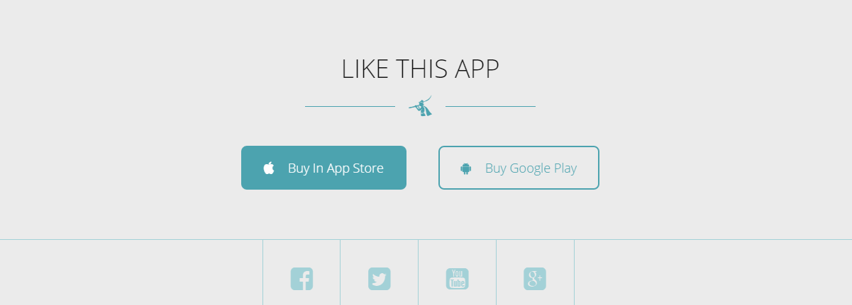
8. Module Like This App
Module type: Custom HTML

Position: home-landing

Module Class Suffix: like-this

Custom HTML

<div class="action animatedParent">

               <a href="http://nootheme.com/" class="app-store animated fadeInLeft" target="_blank"><i class="fa fa-apple"></i>Buy In App Store</a>

               <a href="http://nootheme.com/" class="google-play animated fadeInRight" target="_blank"><i class="fa fa-android"></i>Buy Google Play</a>

</div>


<div class="social animatedParent">

<a href="https://www.facebook.com/NooTheme" class="animated fadeInLeft" target="_blank"><i class="fa fa-facebook-square"></i></a>

<a href="https://twitter.com/noothemes" class="animated fadeInLeft" target="_blank"><i class="fa fa-twitter-square"></i></a>

<a href="https://www.youtube.com/nootheme" class="animated fadeInRight" target="_blank"><i class="fa fa-youtube-square"></i></a>

<a href="https://plus.google.com/100697928077686140656/posts" class="animated fadeInRight" target="_blank"><i class="fa fa-google-plus-square"></i></a>

</div>
Frontend
OTHER PAGES SETTING
About us page Setting
Frontend of About us

Now we’ll guide you to create & configure about us page
1. Module Banner About us
Module type: Custom HTML
Position: top-banner
Module Class Suffix: top-banner
Custom HTML
<div class="partten"></div>
<div class="overlay"></div>
<div class="banner-content">
<div class="container">
<h3>What we do?</h3>
<p>We create, innovate and craft things with love</p>
</div>
</div>
Frontend

2. Module About Us
Module type: Custom HTML
Position: about-us
Module Class Suffix: ||We are small designer team for premium Themes
Frontend

3. Module Our Skill
Module type: Custom HTML
Position: about-us
Custom HTML
<div class="partten"></div>
<div class="overlay"></div>

<div class="container">
<div class="row">
<div class="col-md-6 col-sm-6">
<h2>Our Skill</h2>
                               <p class="subtitle">Crafting With Love</p>
                               <p class="text">Lorem Ipsum is simply dummy text of the printing and typesetting industry. Lorem Ipsum has been the industry's standard dummy text ever since the 1500s, when an unknown printer took a galley of type and scrambled it to make a type specimen book. It has survived not only five centuries, but also the leap into electronic typesetting, remaining essentially unchanged. It was popularised in the 1960s with the release of Letraset sheets containing Lorem Ipsum passages, and more recently with desktop publishing software like Aldus PageMaker including versions of Lorem Ipsum.</p>
</div>
<div class="noo-progress-bar skills lean-bars rounded-bars col-md-6 col-sm-6">
<div class="progress">
 <div class="progress-bar progress-bar-info" role="progressbar" data-valuenow="75" aria-valuenow="75" aria-valuemin="0" aria-valuemax="100" >
 <div class="progress_title">User Experience</div>
<div class="progress_label" style="opacity: 1;">75%</div>
 </div>
</div>
<div class="progress">
 <div class="progress-bar progress-bar-info" role="progressbar" data-valuenow="60" aria-valuenow="60" aria-valuemin="0" aria-valuemax="100">
 <div class="progress_title">Design</div>
<div class="progress_label" style="opacity: 1;">60%</div>
 </div>
</div>
<div class="progress">
 <div class="progress-bar progress-bar-info" role="progressbar" data-valuenow="85" aria-valuenow="85" aria-valuemin="0" aria-valuemax="100">
 <div class="progress_title">Branding</div>
<div class="progress_label" style="opacity: 1;">85%</div>
 </div>
</div>
<div class="progress">
 <div class="progress-bar progress-bar-info" role="progressbar" data-valuenow="95" aria-valuenow="95" aria-valuemin="0" aria-valuemax="100">
 <div class="progress_title">Funny</div>
<div class="progress_label" style="opacity: 1;">95%</div>
 </div>
</div>
</div>
</div>
</div>
Frontend

4. Module Number Counter
To learn more about this module, please see Homepage section.
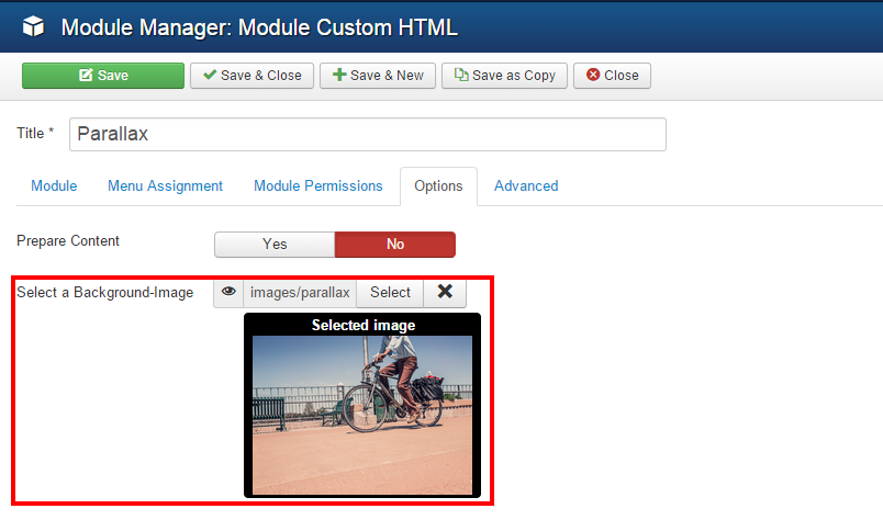
5. Module Parallax About
Module type: Custom HTML
Position: parallax-about
Custom HTML
<div class="overlay"></div>
<div class="partten"></div>
<div id="carousel-example-generic" class="carousel slide" data-ride="carousel">
 <!-- Indicators -->
 <ol class="carousel-indicators">
   <li data-target="#carousel-example-generic" data-slide-to="0" class="active"></li>
   <li data-target="#carousel-example-generic" data-slide-to="1"></li>
   <li data-target="#carousel-example-generic" data-slide-to="2"></li>
 </ol>

 <!-- Wrapper for slides -->
 <div class="carousel-inner" role="listbox">
   <div class="item active">
     <img src="images/customer/customer-1.png" alt="" />
     <div class="comment">
       <p>"Lorem ipsum dolor sit amet, consectetur adipiscing elit. Pellentesque imperdiet purus quis metus<br/>
                           imperdiet ferme ntum. Suspendisse hendrerit id lacus id lobortis."</p>
       <p class="comment-name">"Kathleen"</p>
     </div>
   </div>
   <div class="item">
     <img src="images/customer/customer-2.png" alt="" />
      <div class="comment">
       <p>"Lorem ipsum dolor sit amet, consectetur adipiscing elit. Pellentesque imperdiet purus quis metus<br/>
                           imperdiet ferme ntum. Suspendisse hendrerit id lacus id lobortis."</p>
       <p class="comment-name">"Kathleen"</p>
     </div>
   </div>
    <div class="item">
    <img src="images/customer/customer-3.png" alt="" />
      <div class="comment">
       <p>"Lorem ipsum dolor sit amet, consectetur adipiscing elit. Pellentesque imperdiet purus quis metus<br/>
                           imperdiet ferme ntum. Suspendisse hendrerit id lacus id lobortis."</p>
       <p class="comment-name">"Kathleen"</p>
     </div>
   </div>
 </div>
</div>
Frontend

PORTFOLIO SETTING
Frontend of Portfolio page

1. Module Banner Portfolio
Module type: Custom HTML
Position: top-banner
Module Class Suffix: top-banner
Custom HTML
<div class="partten"></div>
<div class="overlay"></div>
<div class="banner-content">
<div class="container">
<h3>Portfolio</h3>
</div>
</div>
Frontend

2. Module Portfolio
Module type: Noo Portfolio
Position: recent-work
Frontend

K2 PAGE SETTING
1. K2 Instruction
K2 is a powerful & ideal extension that allows you to powerfully control your Joomla content. K2 provides an out-of-the-box integrated solutions featuring rich content forms for items.
To get K2 on your site:
Download K2 component from the website http://getk2.org/
If you are new to K2, go to K2 guide to install and configure the component in your Joomla site.
2. Install & Configure
To install & configure K2 pages, please following these steps:
-
Step 1: Go to your site’s backend: Extensions→ Module manager and upload K2 you’ve downloaded

-
After uploading successfully, you will have the message and K2 information like below:

-
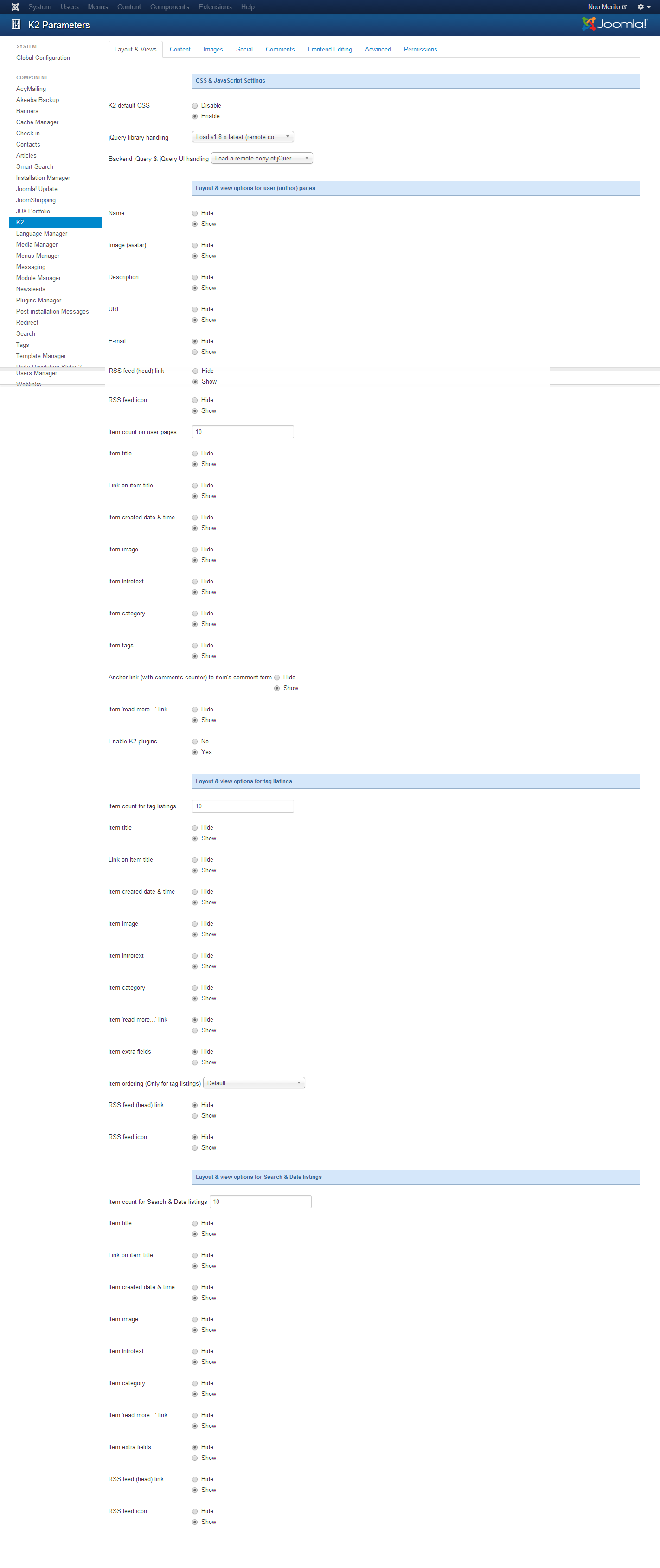
Step 2: Global Configuration
You will find general settings for K2 in Global Configuration. Navigate to System→Global Configuration:
-
Step 3: K2 Categoires
To build K2 for your website like our demo, navigate to Components --> K2 --> Categories:

3. Blog page setting
3.1 Modules in Blog page
3.1.1 Module Banner Blog
Module type: Custom HTML
Position: top-banner
Module Class Suffix: top-banner
Custom HTML
<div class="partten"></div>
<div class="overlay"></div>
Frontend

3.1.2 Module Most Popular Post
Module type: K2 Content
Position: sidebar
Module Class Suffix: popular-post
Frontend

3.1.3 Module Calendar
Module type: K2 Tools
Position: sidebar
Frontend

3.1.4 Module Latest Comments
Module type: K2 Comments
Position: sidebar
Frontend

3.2 Configure Blog page
To have blog page look like in our demo site, please following these steps:
-
Step 1: Go to backend: Components→ K2 Categories→ Select category you want to display Blog Masony page and configure:

You can change frontend by change leading count and Primary count in category.
-
Step 2: Beside, you can configure to display of items,please configure in Item view options in category listings tabs, you can Show/Hide fields you want to display in frontend

TEMPLATE CUSTOMIZATION
1. Creating new Template style
Template style feature (version 2.5 and above) is to assign different template styles to individual menu items. The default template style can be partially or completely overridden by assigning different template styles to the desired menu items in order to obtain a different look for their respective pages.
- Step 1: Duplicate the template default style:
From backend: Go to Extensions→ Template Manager→ Select template jux_forlio – Default then hit the “Duplicate” button to clone template style:

- Step 2: Assign the template style for menu items:
The duplicated template style inherits all settings from its parent template style except the menu assignment (the cloned template style is not assigned to any menu items). Open the cloned template style → Menu Assignment, then assign the template style to menu items. Those menu items will have template style overridden the default template style.
2. Layout Configuration
2.1 Layout Structure configuration
2.1.1 Clone layout:
To quickly create new layout, clone layout in the layout setting panel, all you have to do is hit the “Save as Copy” button. If you are new to T3, you should clone layout to customize so that you always has backup layout.
2.1.2 Switch layout for any template style
Open any template style, go to "Layout" tab, switch layout for current template style.
2.1.3 Assign module position
To assign module position, hover the position you want to change, hit the setting icon then select position. To change number of positions for spotlight block, just select number of position in the spotlight block
2.1.4 Change number of position in spotlight block
For spotlight block, you can select number of positions. It supports up to 6 positions.

2.2 Responsive layout configuration
2.2.1 Select responsive layout
In configuration panel, you will see supported responsive layouts: Large, Medium, Small and Extra Small, select responsive layout to configure.
2.2.2 Disable any position
For responsive purpose, some elements in your site does not fit in specific layout, you can disable the position in the layout. The configuration is only applied for current layout.
2.2.3 Resign positions in spotlight block
For modules in spotlight block, you can drag to resize its size.

3. Layout customization
Sim template is built with T3 Framework , you can refer to T3 documentation for more detail:
4. Theme magic configuration
ThemeMagic is to customize your themes based on pre-define parameters without changing any style file.
Firstly, you have to enable the "ThemeMagic" feature. Open any template style manager, in the General tab, enable the ThemeMagic option. Next, hit the "ThemeMagic" button on the top bar list to open the ThemeMagic working panel

Customize your theme with pre-defined parameters
-
Step 1: Select Theme: all theme will be listed here , select theme you want to customize
-
Step 2: Custom your theme with pre-defined paramers. In the setting bar, open the parameter group you want to configure, change value for the pre-defined parameters.
-
Step 3: you can add External CSS Urls to import and use for ThemeMagic. It's very useful to load web fonts such as Goggle fonts. You can add many external CSS urls, just make sure each external CSS url is in one line. Opening the "Advanced" group, adding your external CSS url, change setting of pre-defined parameters then save as the theme.
-
Step 4: Hit the Preview button to view the changes, if you satisfy with the changes, please save as the theme.

Adding new group and parameters to ThemeMagic
If you want to add new group, parameters to ThemeMagic to customize your themes, please refer to T3 documentation.
MEGAMENU CONFIGURATION
1. Megamenu configuration and customization
1.1 When disable Megamenu
When Megamenu is disabled, the template will use Joomla drop down menu.
To disable Megamenu, open Template style manager, in the “Navigation”tab, disable “Megamenu” option

1.2 When enable Megamenu
Megamenu allows you to display your main menu in different ways and flexibly. You can display menu items in columns, add icon and style for menu item, load module for a module menu item..
1.2.1 Enable megamenu
Open the template style that you want to enable Megamenu, go to Navigation tab then enable the Megamenu option.

In the configuration panel of Megamenu, select menu item/submenu/column or row to configure.
For more detail of how to work with Megamenu, please check out the references below:
-
Megamenu options: how to use options in the Megamenu configuration panel like: how to enable sub-menu, how to assign module, how to add new column/row, etc >> detail documentation
-
Style Megamenu: how to add style for a menu item, sub-menu, column or row in Megamenu >> detail documentation.
-
Add icon for menu item in Megamenu: how to add icon for menu item in Megamenu: Font awesome icons and Bootstrap icons >> detail documentation
-
Animation configuration: multiple animation types for Megamenu: Fading, slide, elastic, room >> detail documentation
-
Video tutorials: how to work with Megamenu configuration panel >> view video now
2. Off-Canvas Configuration
The new Off-canvas sidebar is now independent with Collapse Navigation for small screens. The Off-canvas sidebar displays content from defined position.
2.1 Enable Off-canvas sidebar
To enable Off-canvas sidebar, open Add-ons tab then enable Off-canvas sidebar

Assign module position to Off-canvas sidebar. By default, Off-canvas will be assigned to off-canvas position

Add content for Off-canvas sidebar by creating modules then assign them to off-canvas position

Frontend appearance

Use Off-Canvas as Navigator in small screens
In case you want to display Off-canvas sidebar as navigation in small screens like tablet, mobile, please disable Off-canvas sidebar in responsive layout.

LOGO CUSOMIZATION
Here is frontend of Noo Folio

1. Change the Logo image
There are 2 ways to change logo foJUX Folio template
#1: Change logo from the Template Manager
Each style can go with different logo. To set style for the logo, please go to Extensions→Template Manager→ Select Theme you’re using:

#2: Change the Logo from the variable.less file
Another way to change the logo is changing logo image path in variables.less file, which is located in the template/noo_folio/less
// TEMPLATE LOGO
// --------------------------------------------------
@t3-logo-image:               "@{t3-image-path}/logo.png";
2. Logo Styling
To customize style for logo, open file style.css that is located in the template/jux_forlio/less/style.css folder. Search for the logo text, you’ll find the style where you can either and more styles or customize it as is.
// Logo
// ----
.logo {
 text-align: left;
 padding-top: 35px;
 -webkit-transition: all 0.4s ease;
 -moz-transition: all 0.4s ease;
 -o-transition: all 0.4s ease;
 -ms-transition: all 0.4s ease;
 transition: all 0.4s ease;
 // Left align the logo on  Tablets / Desktop
 @media (max-width: @screen-xs-max) {
   padding-top: 15px;
 }
 a {
   display: inline-block;
   line-height: 1;
   margin: 0;
 }
}
// Logo Image
// ----------
.logo-image {
 // Hide sitename and slogan
 span, small {
   display: none;
 }
}
// Logo Text
// ----------
.logo-text {

 a {
   text-decoration: none;
   font-size: ceil(@font-size-base * 2);
   font-weight: bold;
 }

 &:hover a,
 a:hover,
 a:active,
 a:focus {
   text-decoration: none;
 }
 // Taglines
 .site-slogan {
   display: block;
   font-size: @font-size-base;
   margin-top: 5px;
}
 }
RECOMMENDATION
The above user guide should help one in replicating the Demo site settings for the template and extension on their site.
If you are new or are confused, we recommend installing Quickstart on your local host and use it as reference for configurations. This is the best way to work with any template.You should carefully read all the provided resources to take the maximum advantage of our products.
Support: If you have any issue or question please raise your support queries in our Support Forum or in Our Ticket System. (for Developer Membership only) We spend more time in getting the information from user in case the support guidelines are not followed.